Inspiration and features
Idea and website's features
Idea and website's features.The project has been deveoped for the final exam of the “Information Modelling and Web Technologies” couse of the master's degree in Digital Humaities and Digital Knowledge of the University of Bologna.
The magazine's topic is a personal choice of the project's authors. The selected texts has been chosen among authoritative articles aiming at analyzing conspiracies from differnet points of view and the souces can be found in the disclaimer. in particular, the issue where the texts are contained focuses on the Pizzagate conspiracy theory and, therefore, containes only articles and book-chapters dealing with this topic. This choice has been made so to provide the users with the possibility of comparing documents with references to similar entities.
The entities we decided to highlight are the ones that made more sense to focus on given the topic, named people, places, organizations, events and concepts. Moreover, also general keywords without a specific refrence to the entity type can be added and highlighted.
The website presents the possibility to change between different historically-inspired typographic styles and, in the issue section, the one of annotating and highlight keywords and entities. Furthermore, it is possible to choose between the single text and the comparison view to analyze the documents in the preferred way. In the comparison mode, metadata and entities-related fetures can be accessed by means of a modal, which can be activated by a button on the right side that appears only in two cases: when the user is in the comparison mode and when the screen is not enough wide to display the single-text-modal in a suitable way.
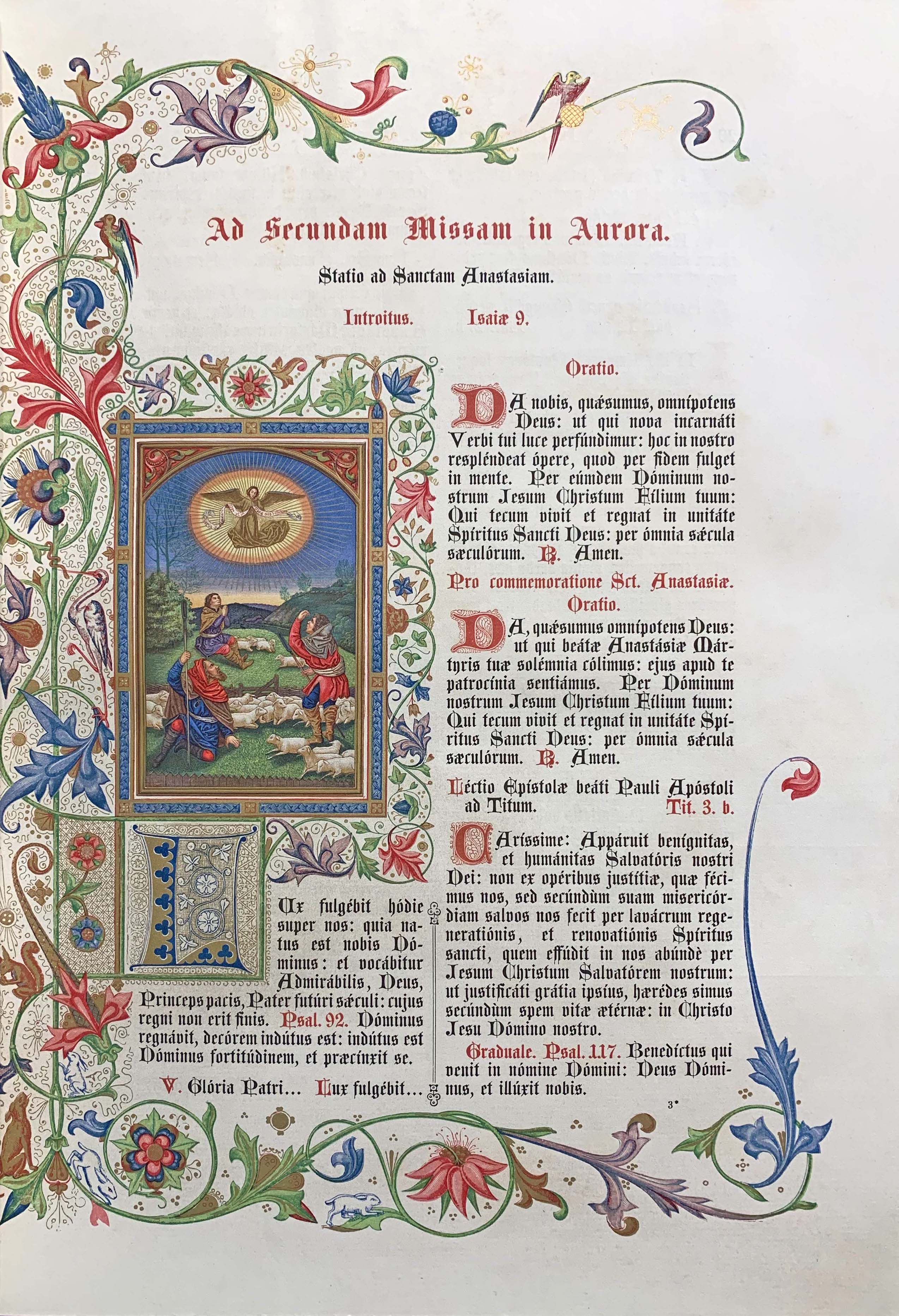
1500To latest incunabula and beyond!
Incunabula are
books printed during the earliest period of typography—i.e., from the invention of the art of typographic printing in Europe in the 1450s to the end of the 15th century (i.e., January 1501).
We decided to refer to this year as a year of "transition" from the incunabula-period to the principles that governed western printing to the late 18th century. in particular, we took inspiration from the typographic type of incunabula, which are the ones made with movable type on a printing press in the style of Johann Gutenberg
and, starting from here, we decided to adapt to the current medium the canonical structures governing the layut of books printed during the 16th century.
It would have been difficult to grasp each detail of about an entire century of print and typographic history, also because the spread of printing to cities both in the North and in Italy ensured that there was great variety in the texts and the styles which appeared.
Therefore, we decided to stick with the basic principles and the main features of these editions.
Layout
Incunabula Layout.We decided to mix a single column layout with the presence of a double column in some sub-sections adding, especially in the homepage, an ornametation on the left side of the text to achieve a more balanced composition. In fact, while
Incunabula's layout designs still resembled the medieval compositions using classical ornamentation, initials and bordering but with a greater use of white space. The incunabula layout designers made a grater use of columns for aesthetical effects
In the classical layout type was generally set in one justified column per page, placed symmetrically on the spread with larger outer margins than inner, and a larger margin at the foot than at the head.
The classical proportions of various segments and margins were determined geometrically, using as a reference the Golden Rectangle, which provides the design its elegant mathematical balance. To achieve such an approximation on this website, we referred to the use of Fibonacci sequence to arrive at relative margin sizes (inner margin 3 units; top and outer margins 5 units; bottom margin 8 units)
.
So, we positioned the texts toward the left side of the page, with a wider right-hand margin that aesthetically anchors the negative space of the page. In doing that we maintained only the above listed proportions, which have been added to constant values in order to make the overall page layout more suited for a web page.
Font and color palette
Font and colors of Incunabula.For what concerns the typeface, we decided to provide the user with a pleasent reading experience avoiding Gothic typefaces even though they were the most used one especially at the time of incunabula, accounting for abput 80% of the editions. Roman type, meanwhile, accounts for 20% of all the types used in incunabula
and are the ones that are still pleasently readable nowadays.
More specifically, we choose Inknut Antiqua, which is, according to its description, designed to evoke Venetian incunabula and humanist manuscripts, but with the quirks and idiosyncrasies of the kinds of typefaces you find in this artisanal tradition
.
Finally, we choose the colors by making use of the "explore" section of Adobe Color and Color hunter.
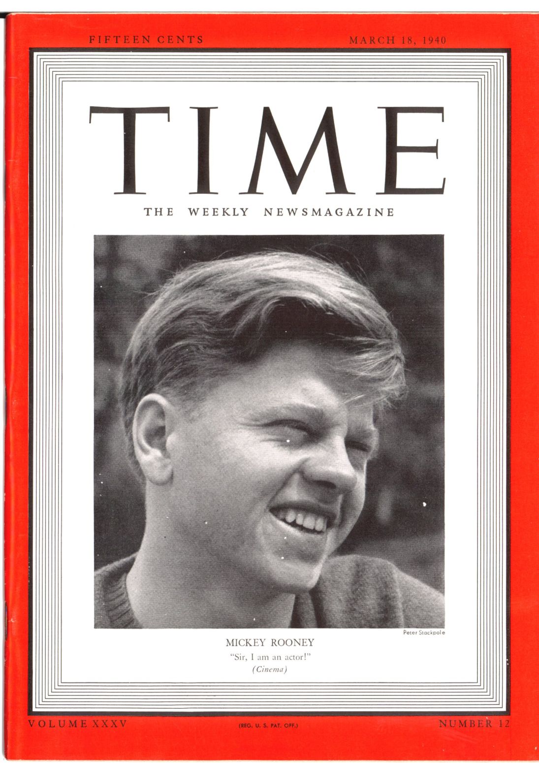
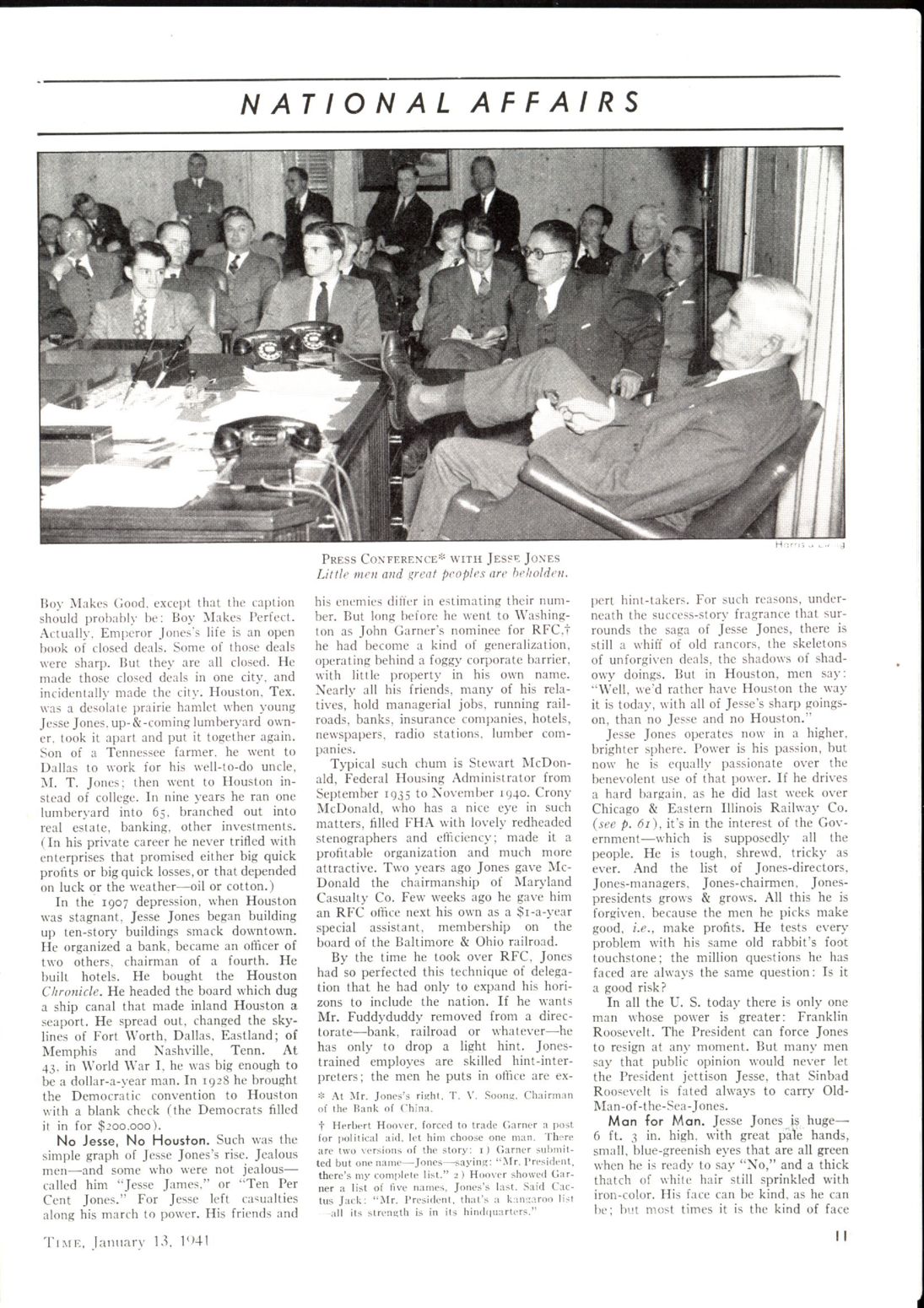
1940The Time and the elegance of vintage
We believe that the design and layout of the 40s were truly elegant and timeless, and we aim to re-discover the elegance of this period through this style. In order to do that, we decided to take inspiration from the Time magazine of these years, which has been, and it is still today, one of the most successfull magazines of all times. The history of the Time begins in the 1922, when:
two young Yale University graduates, Briton Hadden and Henry Robinson Luce, rented the parlor floor of an old house at 141 East 17th Street in New York for $55 a month, bought some tables and chairs for a total of $48.70, and sat down to write a prospectus for a new weekly newsmagazine to be called, after considerable reflection, Time.
The first issue of the Time appeared in 1923 and in a few years it became a worldwide known magazine.
Layout
Time General Layout. The layout and design of "Time" magazine during the 40s made use of clean and simple lines, but with a strong focus on typography. The headlines were large and bold, set in serif typefaces, with a clear hierarchy of information strengthen also by means of sans-serif subtitles and by in-paragraph subsections titles, displayed in the same sans-serif font.
The body copy was set in a legible serif typeface, and the use of black and white photographs was prominent, with selective use of spot color to highlight key elements. Additionally, the "Time" started to add during these years also some paintings and illustrations. These choices, with respect to colors, have been adapted in the style by means of hover effects on images and illustrations, which are generally displayed in black and white, and take back their original colors when the mouse is over them. The overall design was heavily influenced by the Bauhaus, characterized it with simplicity and functionality, features that have been reflected in this style.
Finally, the iconic cover of the "Time" magazine during the 1940s had a strong visual impact, often featuring a single photograph or illustration as the main focal point, accompanied by bold typography. The cover design was simple and clean, with a strong emphasis on the use of typography, using a limited color palette, mainly made of black, white and red. All these information have been gathered from here.
The stylistic choices connected to fonts and colors have been re-adapted where possible. In this way we aim to arouse sensations that could bring back in time the user, transmitting the vintage and elegant feelings that were transmitted by the original copies of the magazine. Additionally, we tried to re-adapt the iconic cover of the Time to the new media, by removing the focal point and leaving more space to the typographic presentation of a sections. This is mainly due to the adaptation needed for the vast majority of devices, with the horizontal orientation of the screen.
Other references: History of Time Magazine.
Font and color palette
Time: Font and colors adaptations. The palette used for the adaptation of the magazine is primarily black and white, with shades of gray and occasional use of spot colors, in particular for images, illustrations, and for the margins of the various pages. The latter, try to arouse the feeling of the iconic cover. Additionally, the use of minimal color is intentional, as it allows the content to take center stage. Our stylistic choices for colors recalls the original color palette of the magazine, we have used the original brilliant red of the cover, that we took from here, and the classical black and white of the magazine.
For what concerns the fonts, we have used the same typeface used by the original magazine for the main titles, that is the serif 'Cinzel', as stated here, and we have used other two fonts to resemble the original typographic hieraarchy of the magazines. These latter are not the original fonts used by the Time, but are pretty coherent adaptations of them:
- the 'Sofia Sans Extra Condensed' is our choiche for the sans-serif sub-sections and sections titles,
- and the 'Crimson Text' has been used as the only serif font for the body copy.
The magazine also featured a consistent grid system, which helped to create a cohesive and organized overall design. The grid system was divided into columns and rows, with strict margins and a clear visual hierarchy of elements. Also this choice has been re-adapted to the new medium in a way that allows a grid-like organization of the space, but with a more flexible and responsive layout made by columns and flexbox. Additionally, we managed to divide some paragraphs by means of periods or stars, as the magazine was used to do in some of its secondary sections. This choice has been drived by the need to make the reading more pleasant and easier, and to give a more dynamic shape to the contents.
For what concerns instead the various margins, we have decided to adopt the classical red, but also to add some squared containers made up of black and white alternated squares. These containers resemble the original containers used in the cover of the magazine. Our choiche reflects this use of boxes in the covers, which are the presentation pages of the main sections of the website. We have also added these boxes to the Issue section, in particular to give a more dynamic shape to the readings. The dimensions of these borders (both the black and white squares, as well as the red borders) seemed to have no clear reference, thus we tried to respect them in the best possible way, but also to re-adapt these when necessary, for a better display of the contents.
Visual references
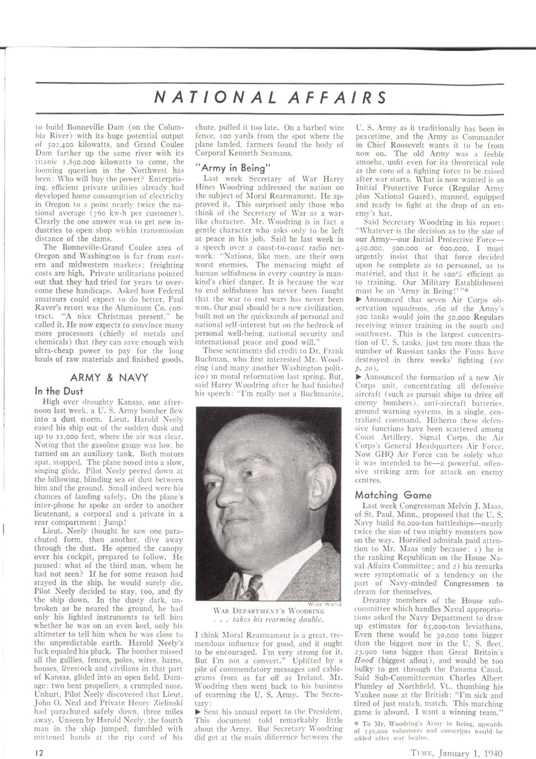
Time references. For what concerns our visual reference, we mainly draw inspiration from the The vault website, which is the official website of the Time magazine. The vault is a collection of the most important articles of the magazine, organized by year and topic. The website is very well organized, and it is very easy to navigate through it. We looked at some different editions of the magazine through the years, starting from the 1930 and ending in 1950. The vast amount of visual references come from editions of the 40s, as the pages we display below:
1950Grid is the answer
The Swiss Grid Style, or International Typographic Style, was maily developed in Switzerland during the 1950s. It is maily
characterized by a cold, emotionally sterile grid style; they used structured layout, and unjustified type [... The graphic artists] searched for anonymous, objective visual communication. They chose photographic images rather than illustration, and typefaces that were industrial-looking rather than those designed for books.
Layout and visual characteristics
Layout and visuals of Swiss.In short, we can make a summary of the main charcreistics of the Swiss Grid System as follows:
- Asymmetrical organization of the design elements on a grid to create Visual unity in a composition.
- Clear and factual way of presenting visual and textual information, using objective photography and illustration, and ensuring that it filters any propaganda and the exaggerated claims of commercial advertising.
- Using sans-serif typography set flush left, ragged right since
The movement believed sans-serif typography expressed the spirit of a progressive age
. - Consistent use of negative space.
- Matte colour palettes.
- Match of monstrous and tiny letters for accents, bold and thing letters to express mood, monochrome and vivid palette to add vibrancy.
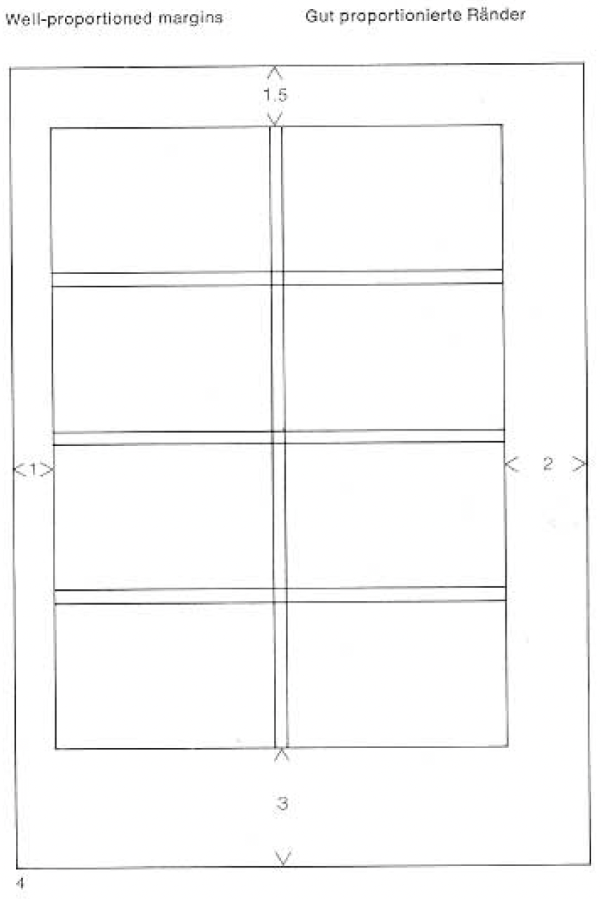
For what concerns layout, we decided to make the neative space a protagonist as much as the page content is according to Josef Müller-Brockmann's priciple stating that the background is an element of design on a par with the other elements (Grid systems in graphic design, page 20). Moreover, we tried to make the text as legible as possible according to these principles by trying to maintain the words per line between 7 and 10, and to try to make the columns width proportional to the size of the type, as suggested by Müller-Brockmann in the same book at page 30 and 31.
In dealing with margins, still according to Müller-Brockmann's principles, we opted for "well-proportioned margins [that] can enhance the pleasure of reading" (Grid systems in graphic design, page 39). In order to avoid errors we directly derived our proportions from what Müller-Brockmann suggests, meaning a left margin of 1 unit, an upper margin of 1.5, a right margin of 2 units, and a bottom margin of 3.
Font and colors
Font and colors from the 50s.The coiche beneath the use of Helvetica Neue has been dictated by many factors. Even thogh it was created only in 1983, Helvetica Neue is a reworking of the well known Helvetica font created in 1957. The changes with respect to the latter are the more structurally unified set of heights and widths, the improved legibility and the heavier punctuation marks.
The scalability of Helvetica Neue gave us the possibility to improve easy reading, given by the font weight and size, and to produce clear contrasts, making the difference between texts width different dimension clearly recognizable.
The color palette we used is based on the Swiss Style color picker.
Other references
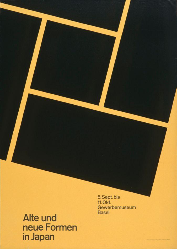
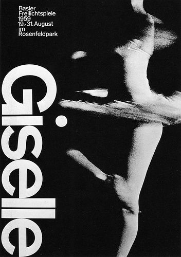
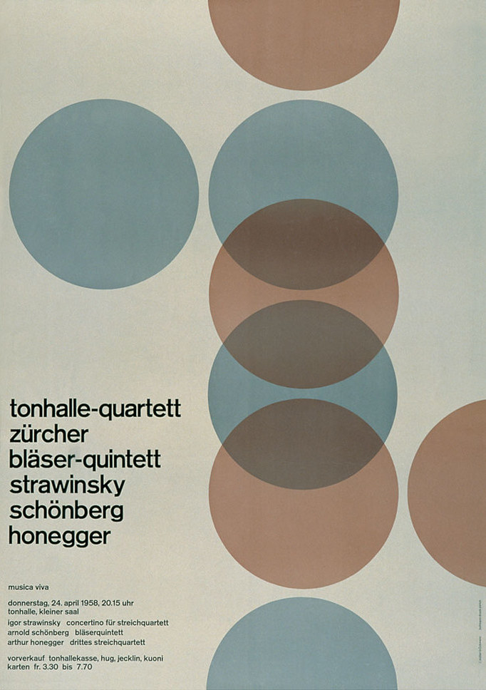
Other references for Swiss.Finally it is worth to mention that the home page animation is based on the Tonhalle Quartett poster by Müller-Brockmann, already animated by Jon Yablonski and readapted by us for the purposes of our website, changing proportions and animations' directions in order to hint at the vertical and horizontal flow of documents. On the other hand, the Pizzagate issue's page presentation has been inpired by the Giselle poster by Armin Hofmann and the documentation's one by the 1959 poster for the Gewerbemuseum Basel.
2030The future
Spoiler: our time-machine widget is not so powerful to project us to the future in order to bring back some reality-based inspiration (we are sorry for that).
For obvious lacks of technological diffusion and availability, we were not able to construct a complete sensorial experience surrounding the user from different points of view. Therefore, our main priority remained the one of imagine and present what the (near) future could look like from a typographic and layout-related perspective, with a margin of citationism towards common fanta-scientific beliefs and cultural references.
The main animation running on top of the website pages if a futuristic eye (a metaphorical look to the future) animated by Julia Miocene, which is in turn based on an image by Gleb Kuznetsov
Layout
Future layout.We tried to make the website as minimal as possible so to enhance the possibility of the user to focus on only one thing at the time. We made great use of negative spaces that inthis case are filled with the inverted background gradient of the above cited animation, which is used as color-background for the whole website.
The text is placed slightly on the left side of te webpage to let accomodate the eye of the user where normally the act of reading and writing in the western word starts, on the left indeed. The overall aim of ths typographic style is the one of making the user confortable and letting someone read without employing too much energies even in the eye placement of the screen.
Fonts and colors
Fonts and colors for future.In this case we opted for two fonts. In particular, Orbitron has been choosen for the titles for its geometrical shapes and its declared aim of being an alternative to common sci-fi based and futuristic typefaces. Moreover, Exo has been chosen for longer texts for its legibility and its purpose of convey a technological/futuristic feeling while keeping an elegant design
.
For what concerns colors, we decided to stick with the colors the animation came with because of the sense of peace they transmit. Still with the purpose of letting the user relax in front of the screen, we opted for avoiding shoking colors or too much contrasts. Therefore, we choose for the texts a dark lue and a violet with some transparency, preferring to convey the feeling of fluctuating over the surface of a distant planet made of milk and blueberries.